Project Type
For Client: Ravisika Hospitality
Role
Brand Identity, Interior Design, Collateral Development, and Execution
Sector
Food and Beverage
Duration
32 Weeks
TL;DR
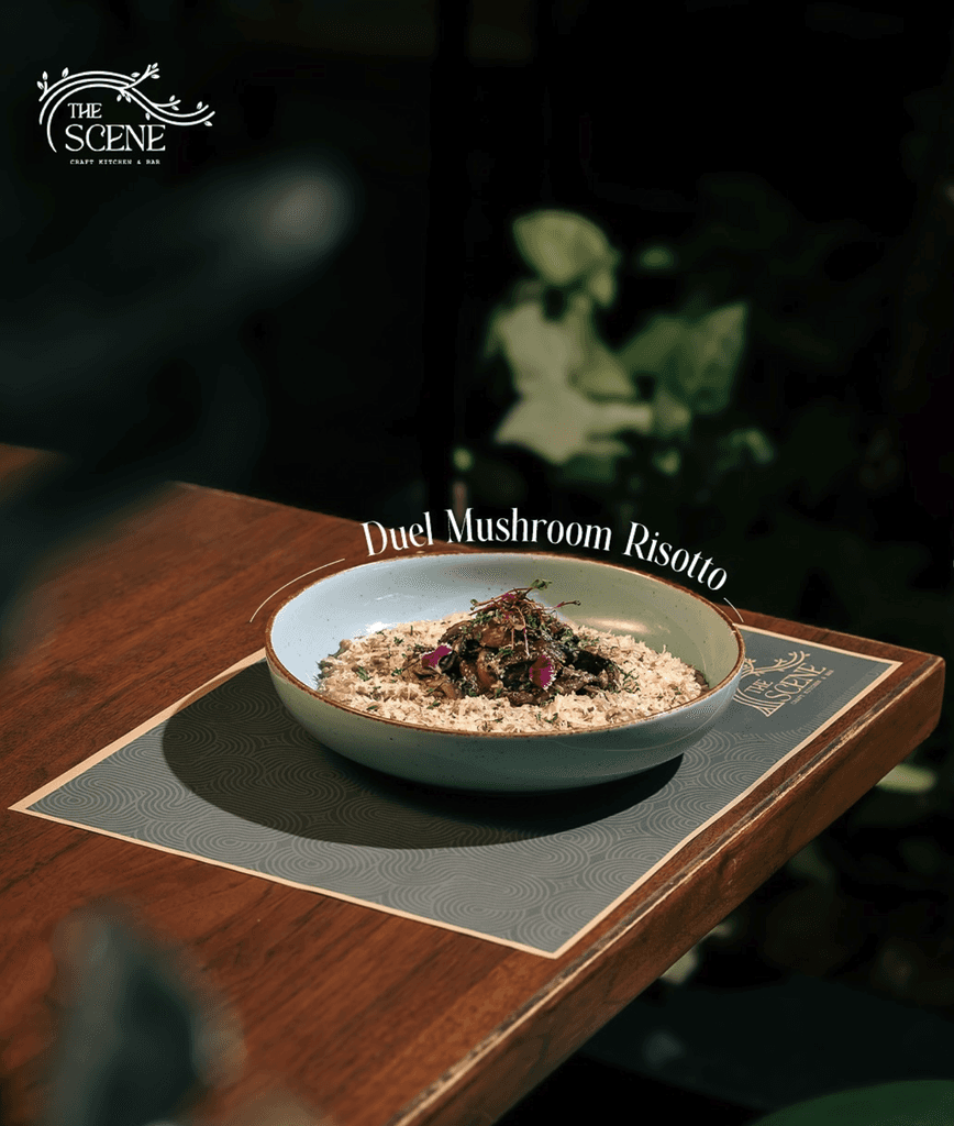
The Scene is an outdoor continental restaurant in JP Nagar, Bangalore, offering a unique dining experience under a canopy of trees. We worked collaboratively to develop a brand identity that reflected the restaurant’s vision. This included logo design, menu design, packaging, and restaurant collateral, blending urban sophistication with the natural charm of the outdoor dining space.
Capturing The Scene’s Nostalgia and Modern Appeal
The Scene, a Craft Kitchen & Bar, aimed to provide a relaxed atmosphere where guests could enjoy exceptional food and drinks amidst nature. Our first touchpoint with the project was to name the restaurant. The name,'The Scene', was inspired by a term Bangaloreans use to describe joyful gatherings (used in the following context "What's the scene bro?"), tying the name back to the city’s nostalgic charm while aligning it with the restaurant’s concept. This identity needed to resonate with diners and create lasting impressions across all branding elements.
From Naming to Interiors: A Holistic Design Approach
Our work spanned naming, branding, and collaborating with the architect to shape the interior design. Together, we crafted a space that seamlessly blended with the outdoor concept, creating an inviting and cohesive atmosphere. The brand identity not only communicated The Scene’s unique concept but also celebrated its name. The name itself inspired the branding, focusing on creating small, relatable stories—like caricatures of diners with pets, friends laughing over meals, or the building’s facade—to forge emotional connections with customers. This approach ensured flexibility and versatility for future ventures while creating a seamless and immersive dining experience:
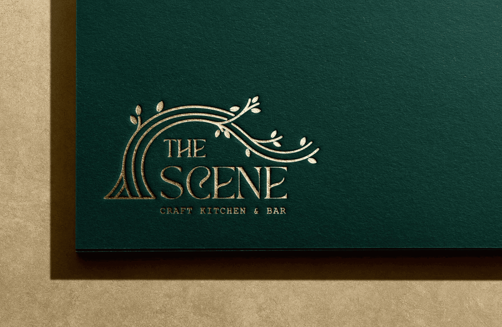
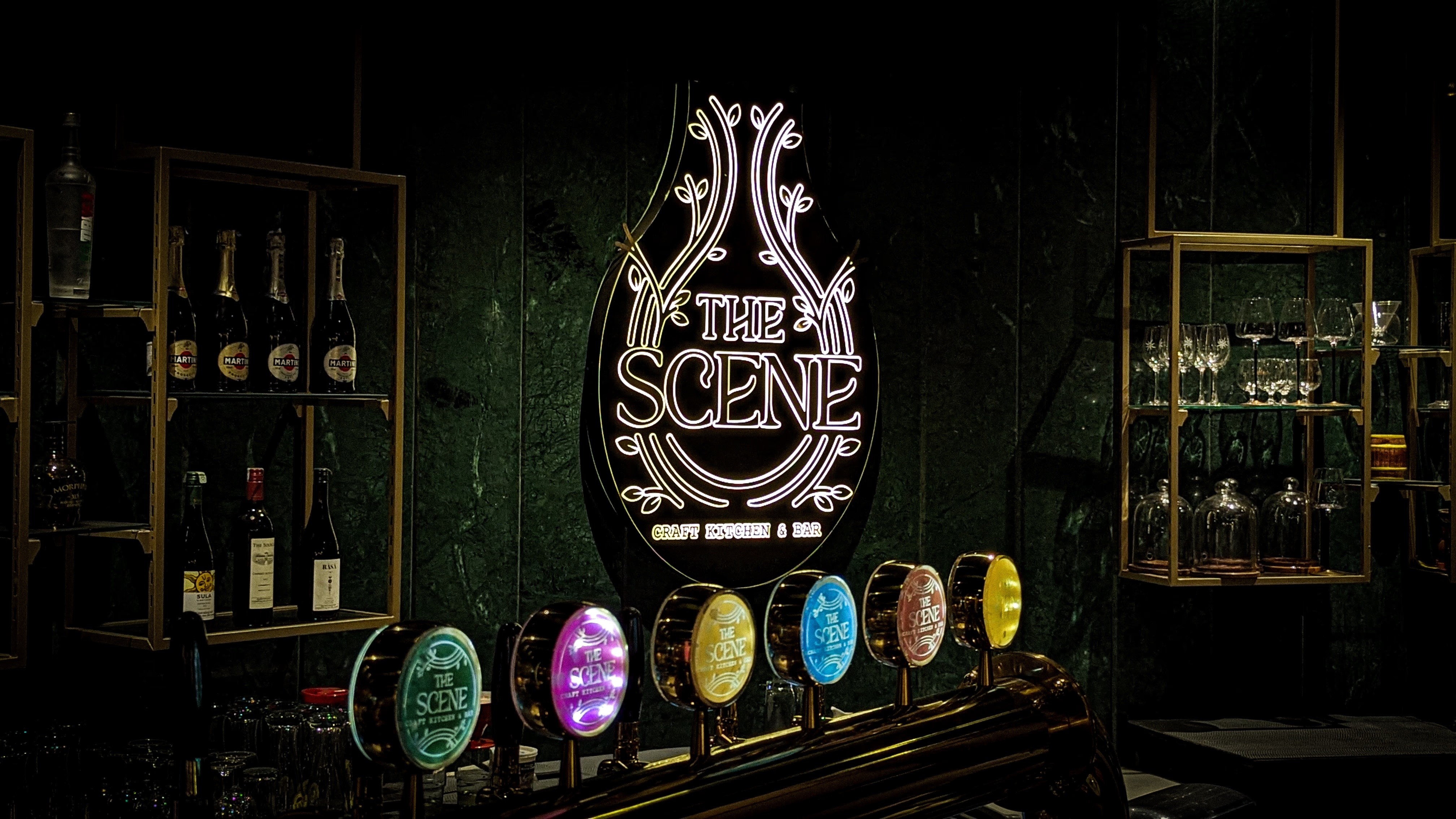
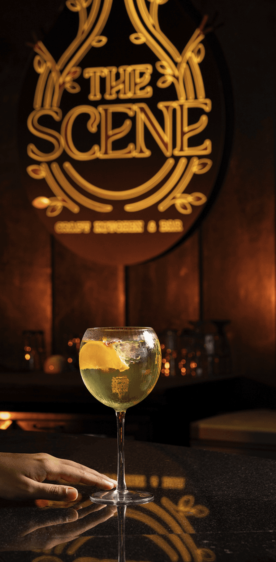
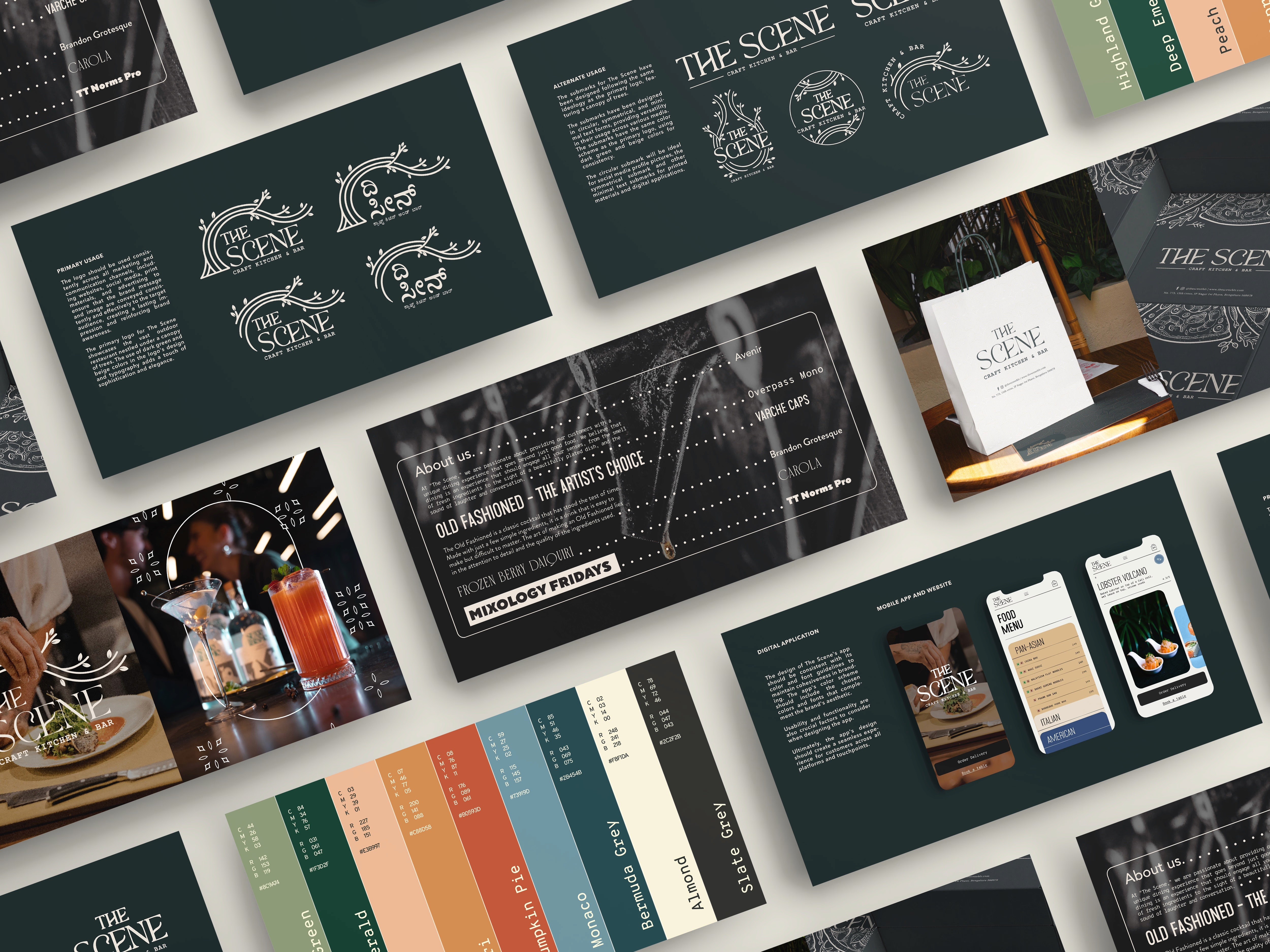
Logo Design
The logo featured a canopy of trees, encapsulating the restaurant’s connection to nature and its outdoor dining concept. Submarks provided adaptability for digital and print media while maintaining visual consistency.
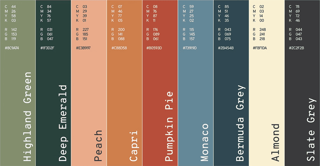
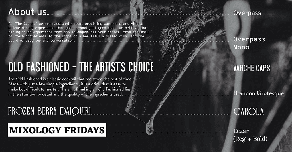
Typography and Color Palette
A curated selection of fonts, including Overpass and Brandon Grotesque, balanced modernity with warmth. The color palette featured Highland Green, Deep Emerald, and warm tones like Peach and Pumpkin Pie, evoking the natural and inviting ambiance of the restaurant.
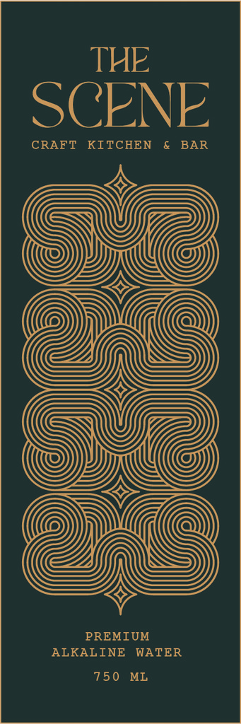

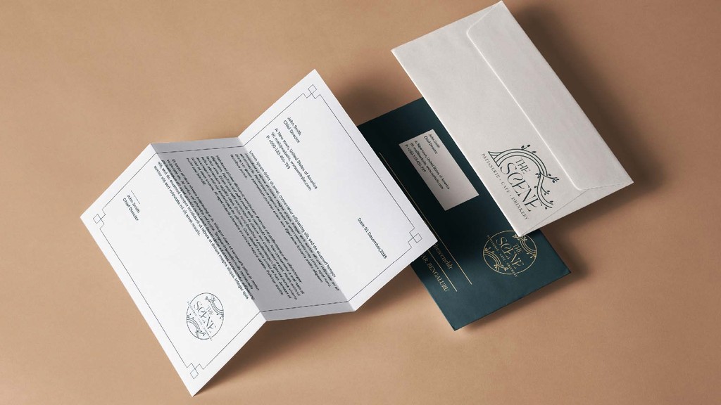
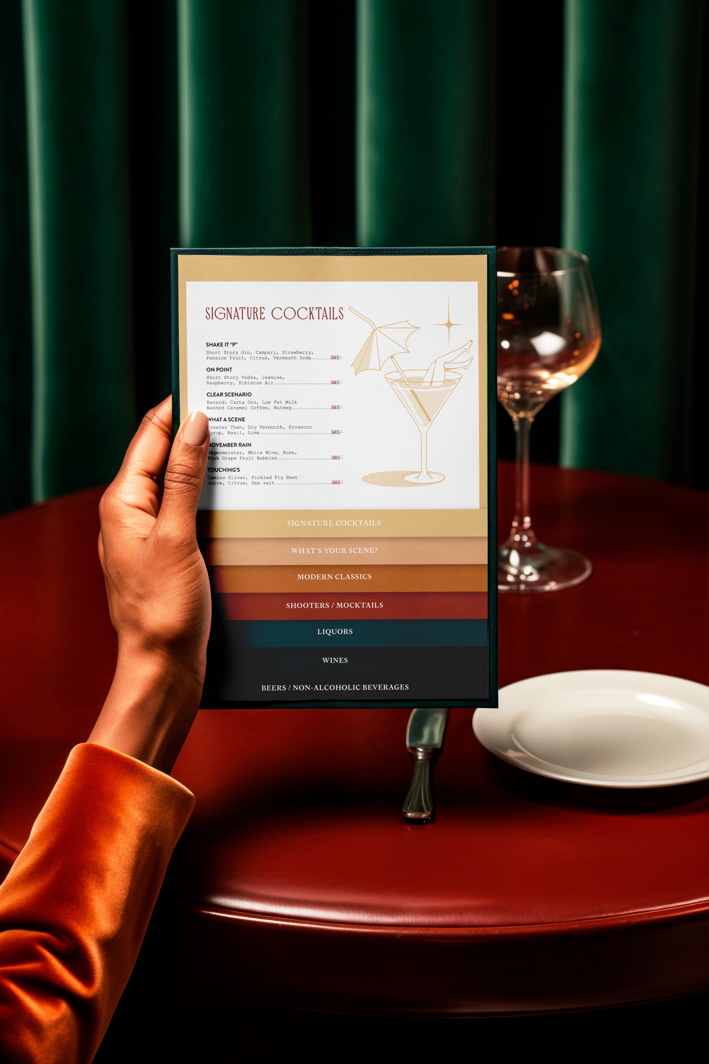
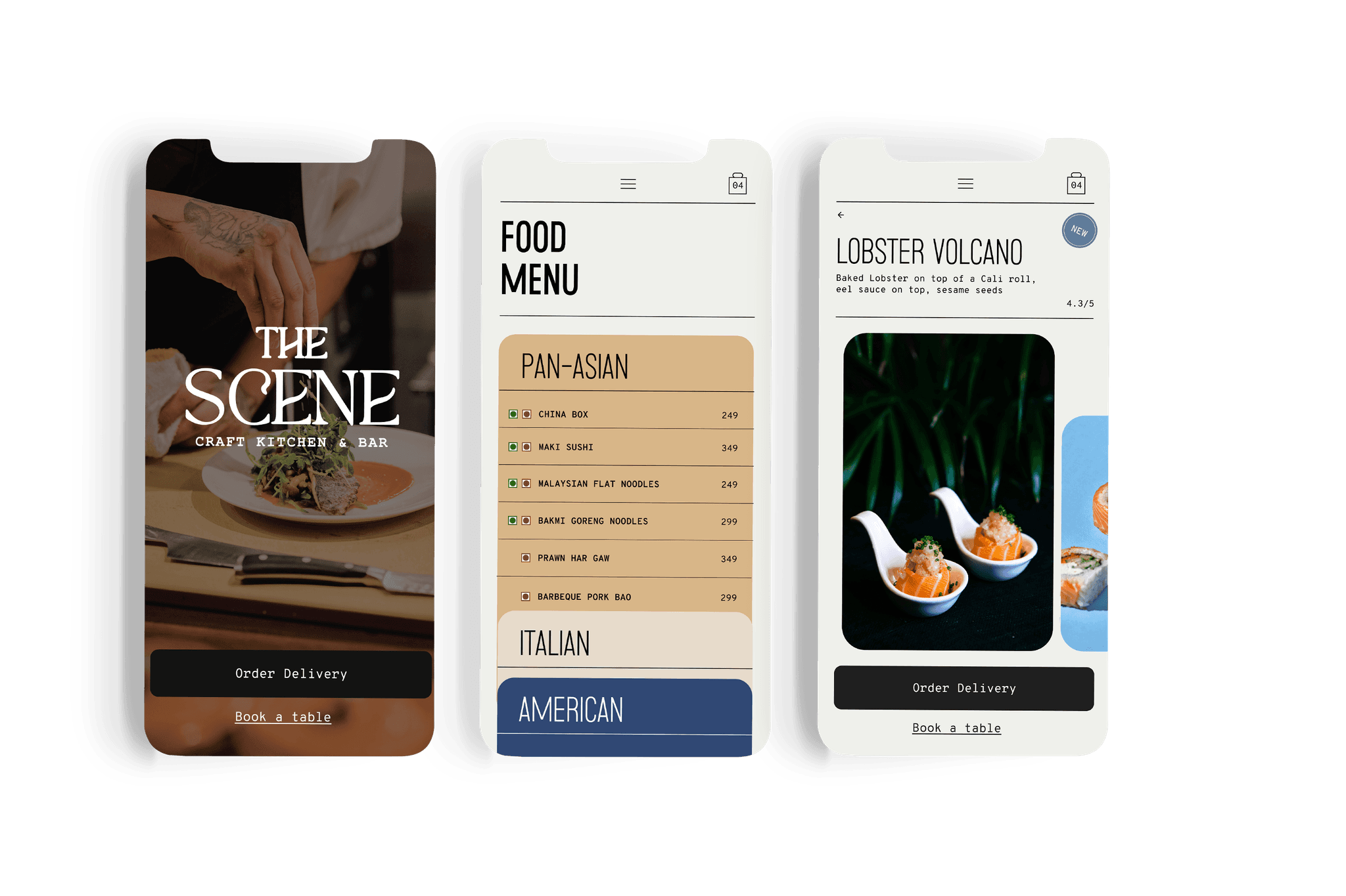
Packaging and Collateral
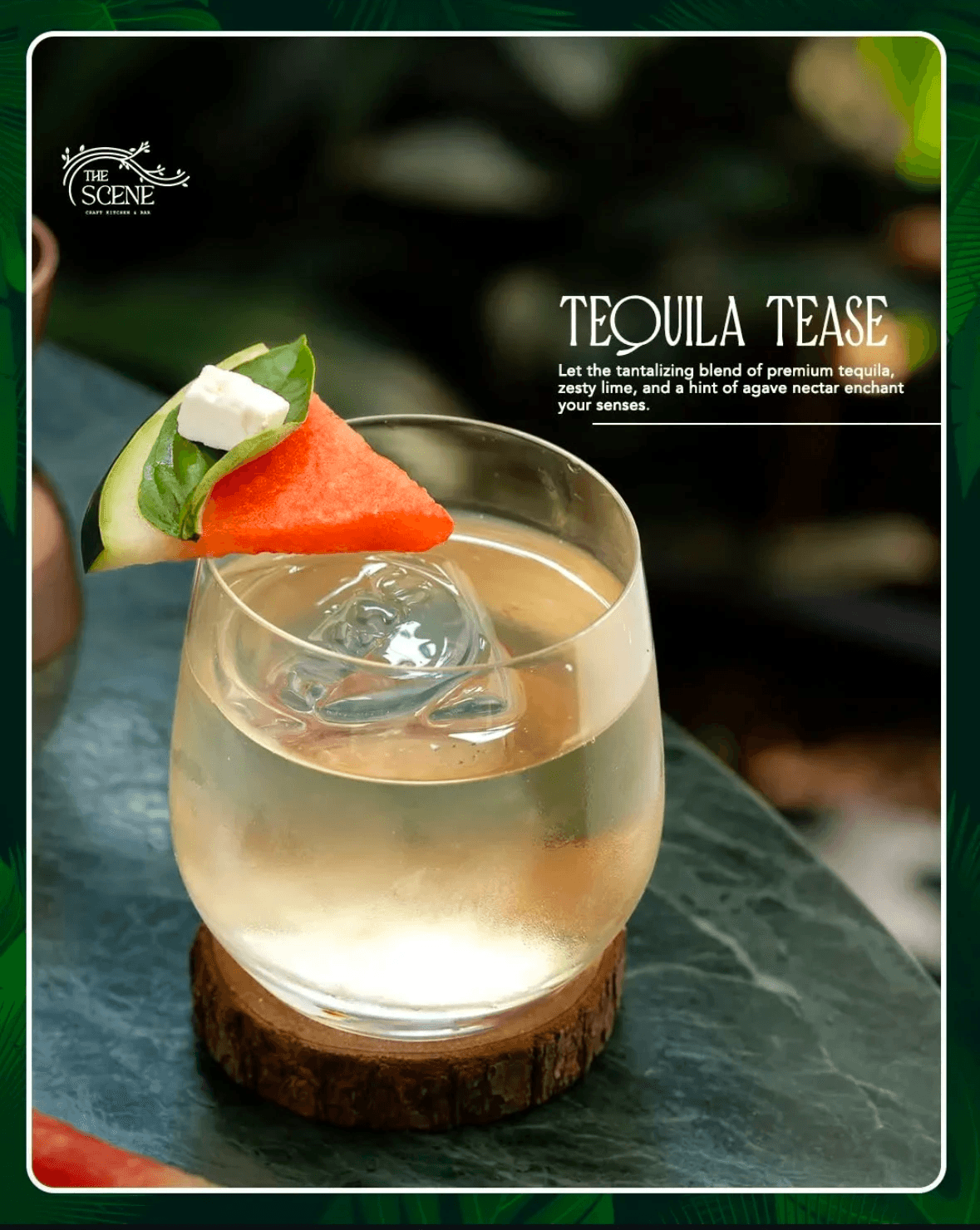
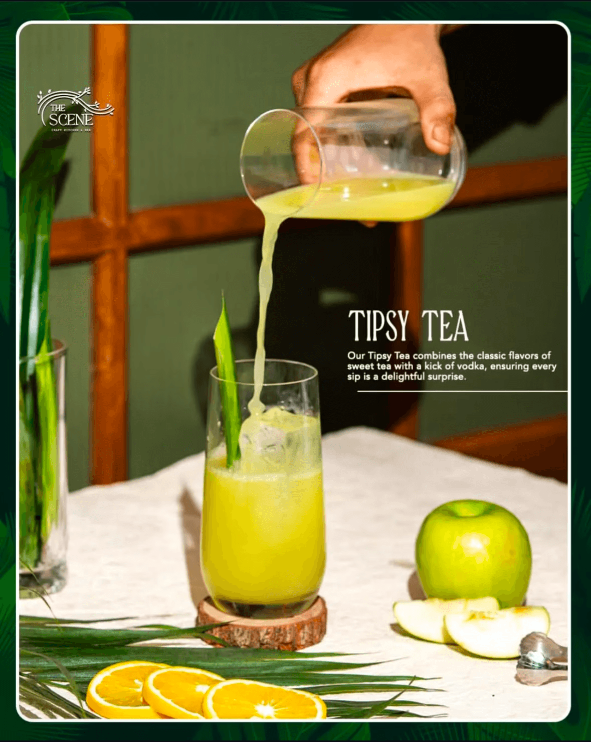
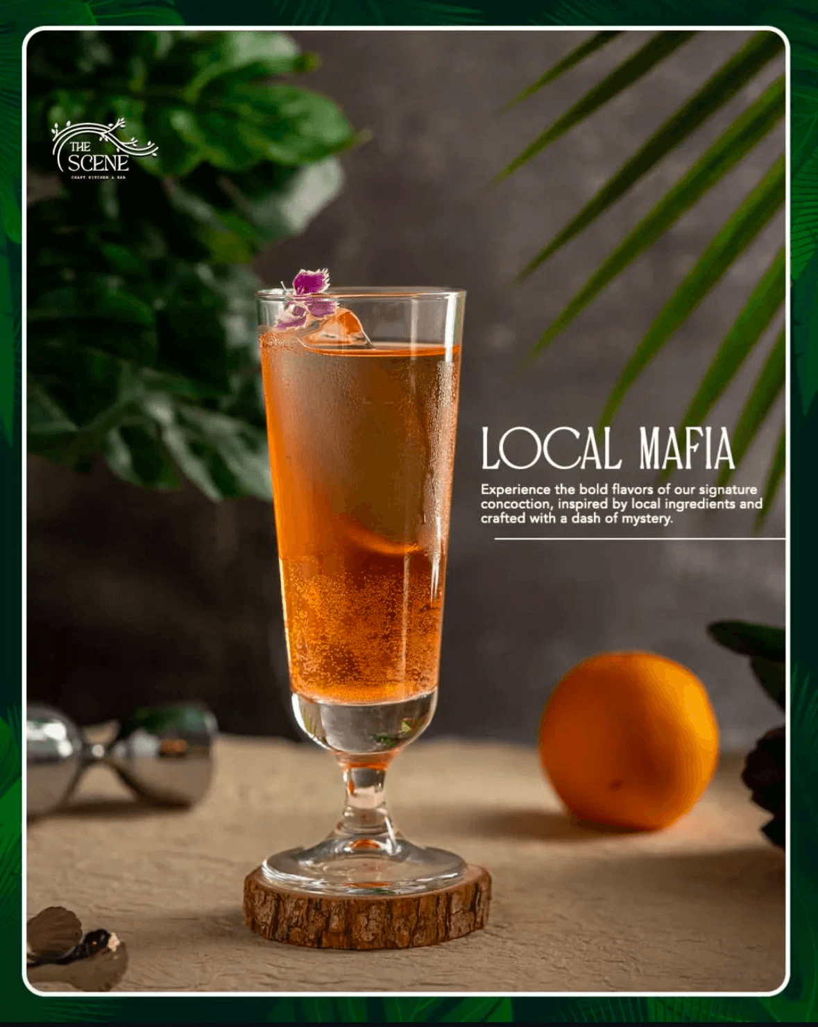
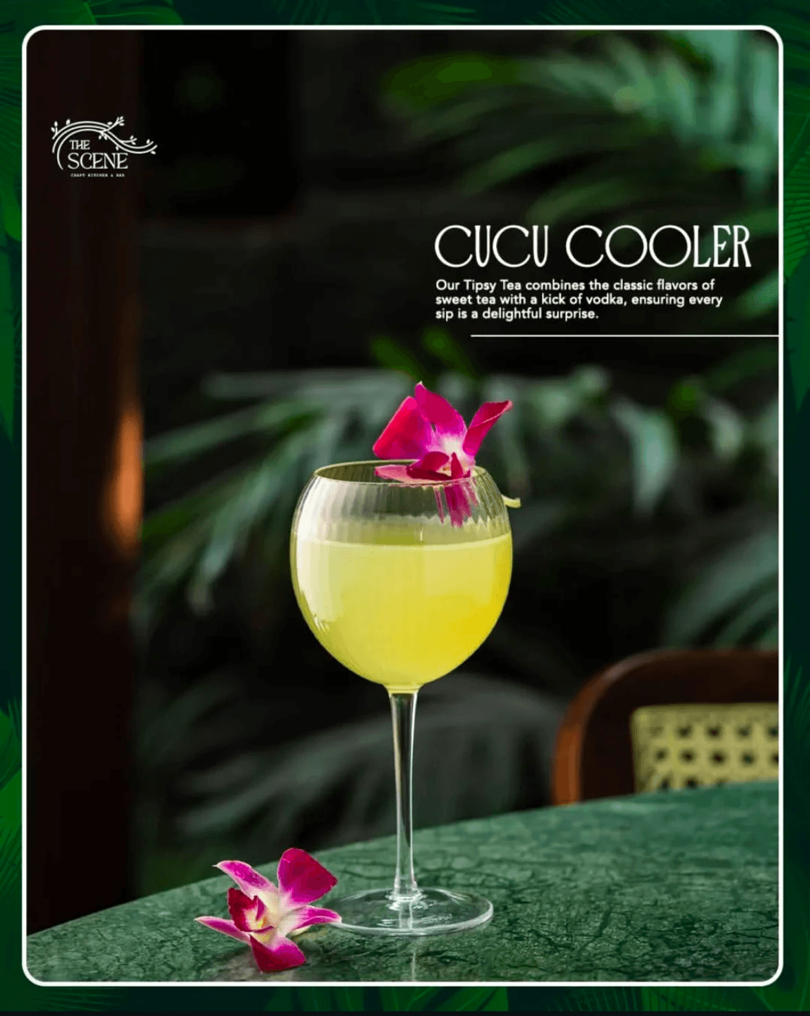
Takeaway packaging mirrored the in-house dining experience, while menus, signage, and coasters reinforced the brand’s identity. Each design element was thoughtfully crafted to reflect the restaurant’s values and resonate with its guests.
Key Insights from The Scene
Designing for a Unique Concept
Harmonizing aesthetic components with the eatery’s organic and modern motif was vital in shaping a unified brand journey.
Collaboration Drives Success
Close coordination with multidisciplinary teams ensured the visual identity translated seamlessly across all touchpoints.
Comprehensive Brand Guidelines
Establishing detailed brand guidelines was essential for maintaining consistency and evolving the brand over time.
The Scene’s branding elevated its market presence, establishing it as a must-visit dining destination in Bangalore. This project underscored the importance of aligning visual identity with business values and creating designs that resonate deeply with audiences.